There is little doubt in pointing out that responsive website design is by far, one of the most important elements of a business marketing strategy for online marketing in 2016 and beyond!
In a time when more and more customers are using the internet from their mobile phones, a company’s website is the first thing customers search to get a first impression about the brand and the product or service they are offering.
If the website is poorly designed and is not engaging enough, it can lead to a negative first impression on customers and cause them to easily switch to rival brands.
For this reason, we share the top responsive web design practices you need to be aware of for creating a unique website design experience for your customers.
Focus On Conversions
It is crucial that you approach web design from the point of achieving high conversion rates. However, this goes way beyond the aesthetic aspects of the websites.
In fact, it is about the ease at which they can navigate across different web pages and access information that they want regardless of what they device they are using (desktop, tablet, or mobile phones).
You can build the most attractive website, but still find frustrated visitors.
Why?
It is because the website navigation is extremely poor, and the average visitor goes through a painstaking experience to find the information they want to have.
Therefore, you should incorporate the right mix to enable high conversion rates.
These include:
- Web Copy
- Images
- Color
- Page Speed
- Website Navigation
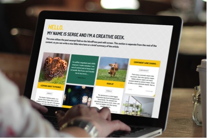
Your images need to be highly engaging and be able to immediately capture the attention of the visitor. As for color, the website needs to have an attractive color scheme. Web copy also is important, but needs to be concise and relevant.
With Google’s E.A.T philosophy, content is at the core of their last algorithm update. Lastly, there needs to be smooth navigation controls to help users navigate through your business website.
Leave Some White Space
Perhaps the biggest error web designers can do is to mistake white space for lack of content and originality. Having white space does not really translate into an empty website.
Rather, it displays a de-cluttered website that makes it easy for visitors to browse through information.
Many companies make the awful mistake of turning their websites into newspapers. In fact, even online news sites have more white space than many company websites; the result is a poor reading and browsing experience.
However, ensuring adequate spacing between different elements of the website will ensure more enjoyable site navigation and browsing experience.
Make Good Use of Typography
Since websites are mainly text-based, there is a chance that many web developers will use standard fonts for their headings, sub headings, and other sections.
Considering how websites are a means to differentiate one company’s brand appeal from another, using the same standard fonts can easily result in companies losing their marketing edge over their customers.
Typography, thus, is one area where designers have the freedom to innovate. You do not necessarily have to use Arial, Times New Roman, Tahoma, and Verdana fonts any longer.
There are plenty of custom font styles that you can use to give a unique value to your brand and website through which you will be in a better position to differentiate yourself from your competitors.


